Business Case: Responsive Images per content slot for SAP Commerce
One of the integral features we provided for one of our customers was the ability to show certain images on certain viewports in certain content slots.
Background
Usually, on a Content Page, several image files show the same motive only in different resolutions and dimensions depending on the current screen size (Desktop, Tablet, Mobile). This requirement typically is solved by HTML’s picture tag (respectively the “srcset” attribute by the IMG tag) which is supported by any modern-day browser. This HTML default feature allows the cms user to have the browser fetch the right image needed for the current viewport, limiting the number of resource requests to a minimum.
However this feature has its shortcomings since the need for a certain resource is based on the current viewport’s width, and not the actual amount of space available by the DOM the image is referenced in. Some areas might not take up the entire content area’s width but only half or less of it.
The Customer’s Need
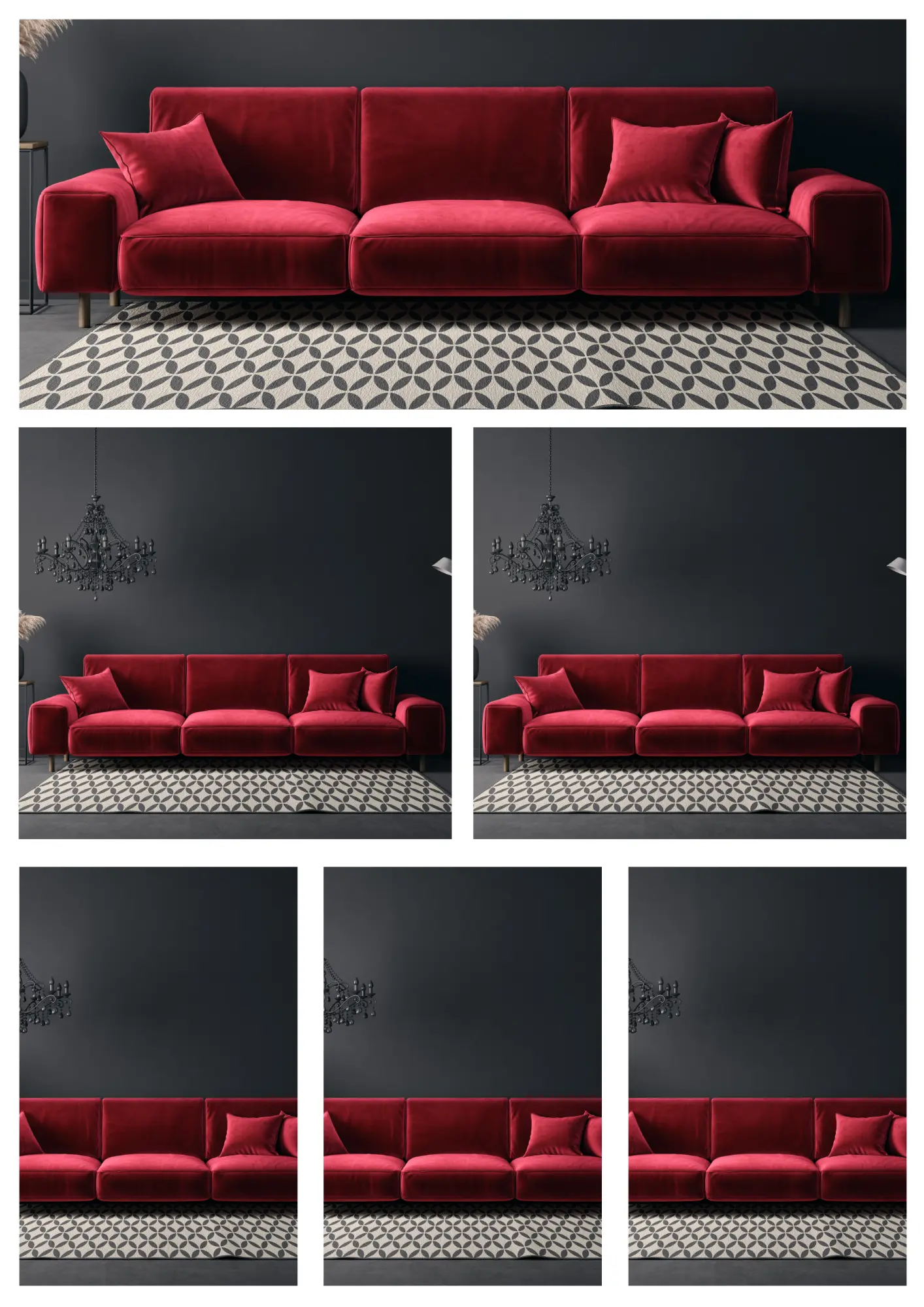
In our customer’s scenario, we have a layout that can feature up to four different Content Slots in one row and a source of images can be part of a component that is shared across multiple slots. An Image contained by a 100% slot might have different dimensions than one within a 25%-Slot. This means the same image container must have a different ruleset defining which resources are relevant for certain viewports.
E.g. Component A in Slot100 on a XL viewport (desktop) is supposed to render the image’s src-URL for the 21:9-image while within Slot50 it should rather point to a 1:1-Image
On Viewport SM on the other hand component A within Slot100 should rather render a 16:9 image but remains a 1:1 image within a Slot50.
In special cases (special text/image component layouts with limited space for the image) some slots are defined to render a more landscape-like image for smaller devices but refer to more mobile-like ones on Desktop.
Note that these images are not cropped by css but are actual different medias with different proportions but belong all to the same data object/container that is shared across these slots
How we solved it
Since every DOM resembling a content slot can be identified by a certain class describing its ratio in its current row of content slots, we pass that information to every single content component within (usually one component per slot).
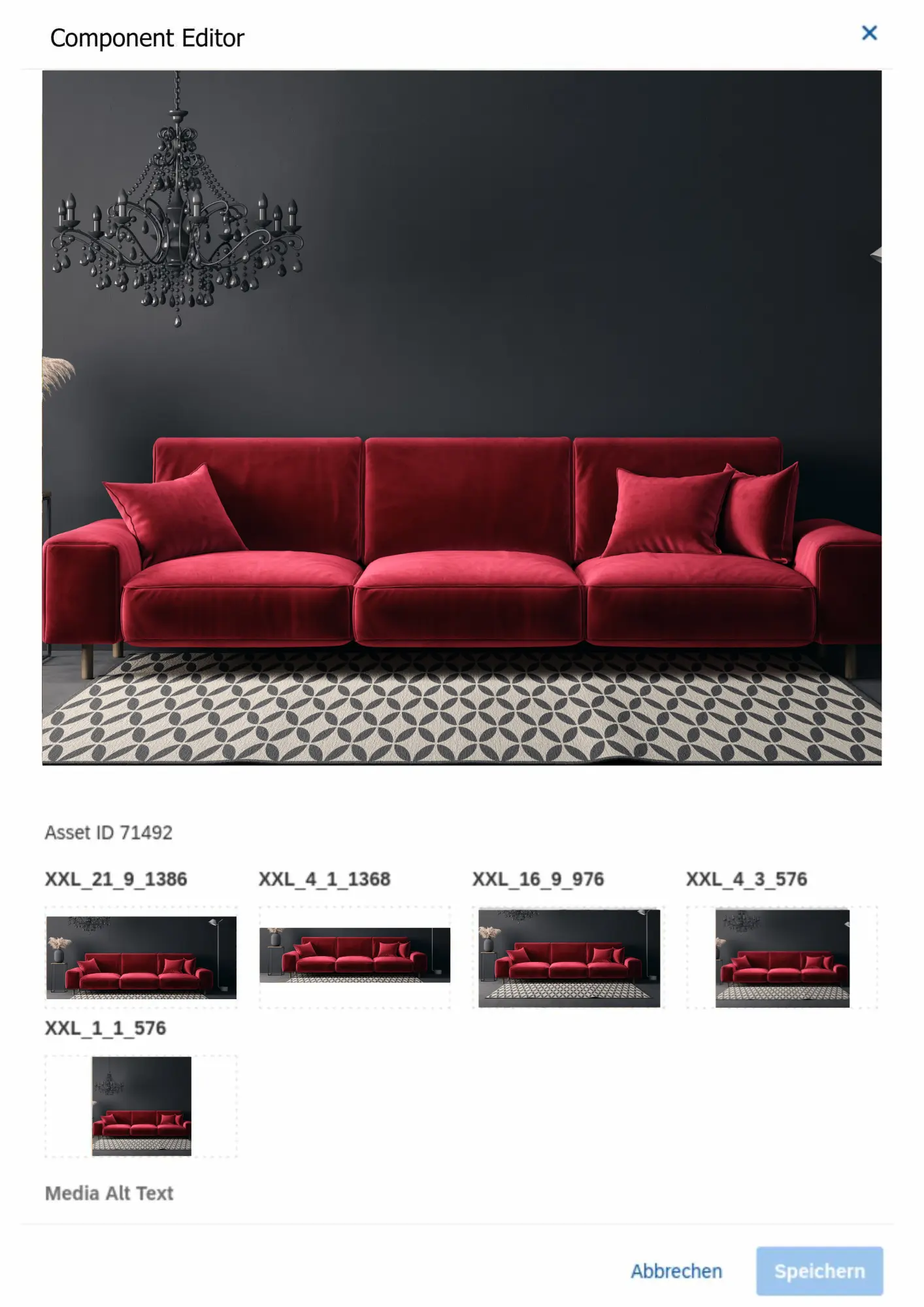
Each component type has its own ruleset of what image dimensions are supposed to be rendered for which kind of slot. For every image component, we are generating the HTML and the srcset value depending on the current slot width. So every instance of a content component receives the same source information for ALL resources available the content slot id dictates which of those are assigned to what viewport.
How it looks like
The component is aware of which slot it is in, and depending on the slot it is in different images for certain viewports are selected
these are the top 100%slot and the first 25% slot, and 50% and they are configured to render different kinds of resources for mobile viewport
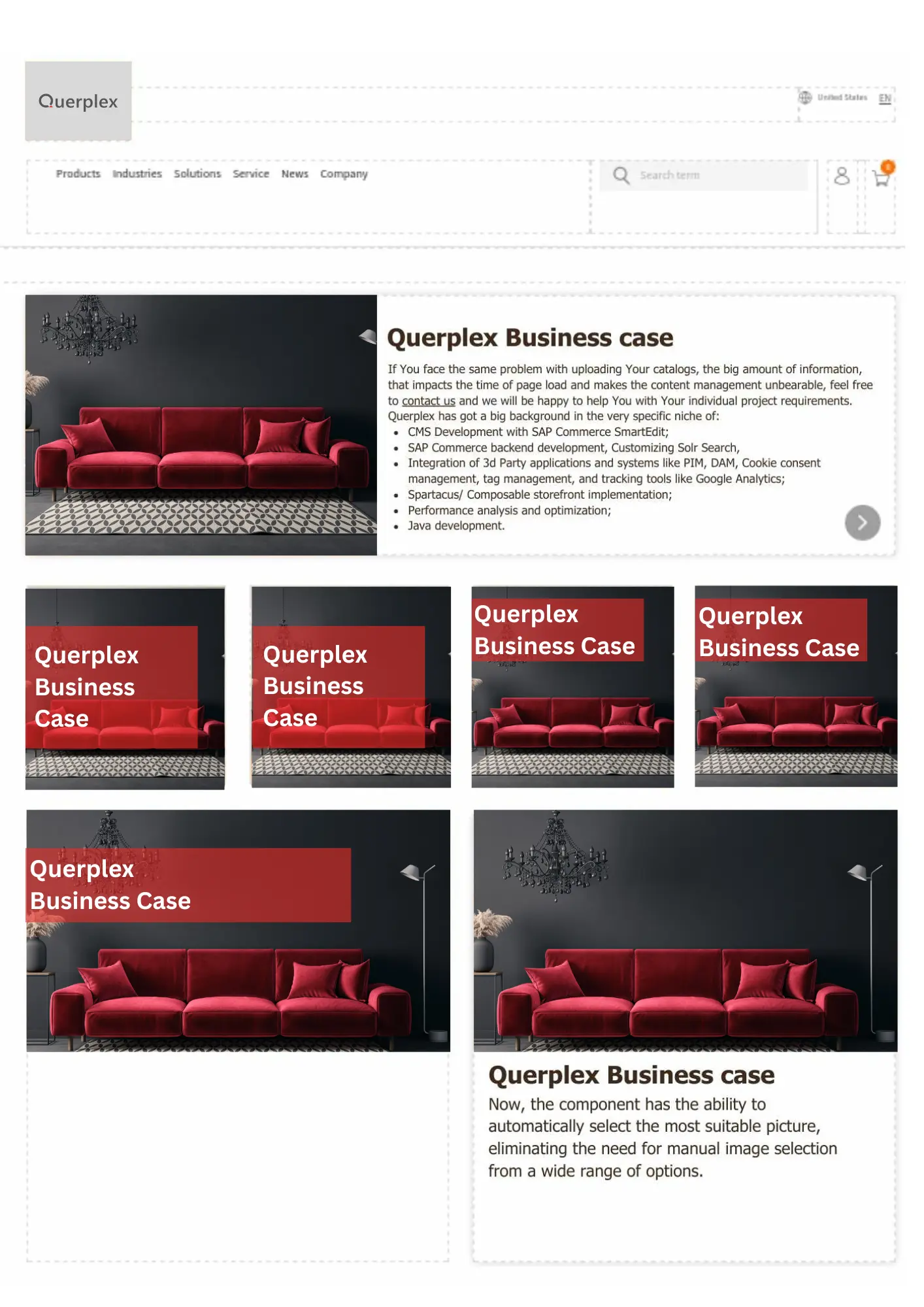
If You face the same problem with uploading Your catalogs, the big amount of information, that impacts the time of page load and makes the content management unbearable, feel free to contact us and we will be happy to help You with Your individual project requirements. Querplex has got a big background in the very specific niche of:
And be sure to learn more about Magic Templates here:


Kontakt direkt
Querplex GmbH Nürnberg
Tel.: +49 (0)911 941198 0
Querplex GmbH Nürnberg
Kornmarkt 2
D-90402 Nürnberg